
Almost as long as I was writing Not Famous I was thinking about its cover. I tried coming up with my own and that really didn’t work out so well. In fact, those cover concepts were so embarrassing I recently deleted them.
Because of that experience I decided that a photographic cover was probably the way to go. I knew this was a departure from the types of covers you usually expect from lad lit novels, but at the time I was convinced that an illustrated cover just wasn’t going to work.
So, I searched for a good photo. I scoured stock image sites up and down, left and right, trying to find the best photo. One thing I always knew was that the cover would feature Alli Conwell. Not Famous is her story, and in my mind, she was the one to be featured on the cover.
Eventually, I found the perfect photo. I then hired someone to do a simple cover with the photo, and after a lot of back and forth on fonts, this is the cover that I picked:

I loved this cover. It was simply stated, and I felt the tone matched the book fairly well. It was a gorgeous cover and it inspired me to keep at the writing. Yes, the book cover was done before the first draft. I was thinking ahead. I didn’t want to worry about the cover after the book was done, after all.
Anyway… three years later I was still set on this cover. That was, until, I finished the first draft of Not Famous and started thinking about marketing. Not Famous is a lad lit novel, and lad lit, according to Wikipedia “is a fictional genre of male-authored novels about young men and their emotional and personal lives, often characterized by a confessional and humorous writing style.” During the writing and editing process I struggled with the humor aspect, because I hadn’t written the book with the intention of making people laugh out loud. But, to meet the expectations of the genre I realized I had to “funny-up” some dialogue and situations for the readers’ benefit. Truth be told, I think those humorous bits helped the story.
But then I had another problem. Suddenly, the cover I loved… well… it just seemed like the wrong look for the book.
I convinced myself to give the cover more thought. I reviewed the covers of other lad lit authors and found that for the most part they were illustrated… and if a book’s cover is important to actually selling the book (spoiler alert: they are) then I needed a cover that was more genre appropriate… if I wanted to sell books—which I do.
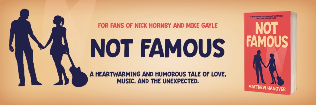
So, I told my designer to rethink the cover. The new cover would have to feature both Nick and Alli Conwell on it, and make sure it’s clear that Alli is a musician, and scream “lad lit.”
After a couple of days, this is what I got:

This couldn’t have been more different from the previous cover, but I loved it too. It was genre appropriate. It was bold, and colorful. And I loved how the spotlights come from the word “famous.”
I still loved the photographic cover though. I considered using both… having the photographic cover for the US version of the book, and having the illustrated cover for the UK, Australia, and other areas where lad lit has a wider audience. I was advised against that idea by the indispensable Jon Rance, and ultimately decided I had to pick one. If you’re reading this, you know which one I chose.
Click here to be the first to know when Not Famous is available for pre-order.

One response to “The Book Cover Evolution of ‘Not Famous’”
[…] The Book Cover Evolution of ‘Not Famous’ — Over on his website (with a spiffy new design), Matthew Hanover has been chronicling the process of getting his first novel ready for the world. I enjoyed reading this piece on cover design and the thinking an indie author has to put into it. […]